Now that the living room is complete, the kitchen is on the agenda: BRIGHT YELLOW

Which means I need to seriously figure out the rest of the house!
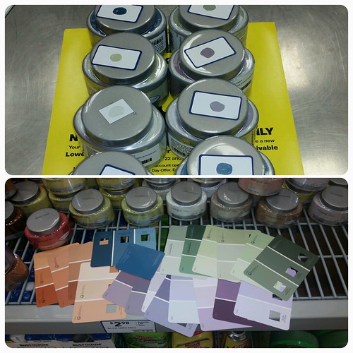
These are the colors we are thinking.
Dining Room: Blue
In real life? I want to love the darker color, but it looks too dark. I like the top/bottom shade (it’s the same) but it looks, as HMMWS says, a but cartoony. The light one is fine (and same color we did in the house in Ransomville before we sold the house.) HWMMS is NOT a fan of either blue but for the light one. However in this photo? I’m totally in love with the darker color and the top/bottom color. Too bad it doesn’t look like that in real light.
Master Bedroom: Purpleish…
Oh my. I picked the wrong tones completely! I don’t like any of them, but I’m leaning towards trying out more samples between the two lightest shades. I want a more silvery tone. Not red or blue. Oops!
Two Story Giant Foyer: Mossy Green
Arugh. Again the photo is not what it looks like in real life. I’m completely enchanted with the middle color, but in person it’s more spring green….which I worry will look odd with the blue we pick out in the dining room (the two rooms are basically open to one another) The middle green goes better with the “cartoonish” blue in real life. I like the dark green as well and so does HWMMS but I’m afraid it will make that gorgeous large sunny bright entrance way WAY too dark. Perhaps a shade lighter in that color family? Although, I really do like the middle one. The top one, WHAT WAS I THINKING? Um, no.
Mudroom/Laundry Room
EEK! TOO BRIGHT TOO BRIGHT! Again, the colors in real life do not look like the photos. The one on the left is orange and the one on the right is peach. I was hoping for more of a butterscotch orange/terra cotta but the darker one on the sample felt too dark. I think I thought wrongly and will have to try darker. I swear though, if the color on the left actually looked like the photo, that would be a good match, but it doesn’t it is so much more orange.
To Be Continued!
Leave a Reply